Why Does Colour Matter in Branding?

Colour matters in branding because it can shape the emotions a brand evokes, giving businesses a powerful way to communicate personality without saying a word.
Illustration showing colour swatches

Colour is everywhere. We use it to identify spaces and things, organize information, signal danger or tie a room together in an unexpected way. It’s also helpful in determining if that one banana is past its prime.

Being that ubiquitous, versatile and impactful, it makes perfect sense that colour plays a crucial role in your brand too.

Choosing brand colours isn’t as simple as deciding that blue means trustworthy, green means natural and red means exciting. Colour is subjective. Its meaning changes depending on context, culture, industry and most importantly, what you do with it.

A great brand palette needs to do more than look good in swatches. It needs to reflect and reinforce the ideas and personality behind your unique brand identity.

Why are brand colours important?

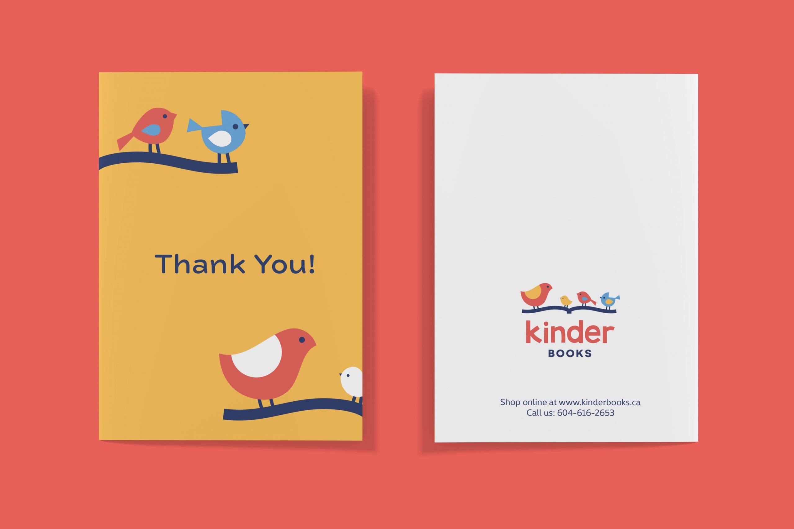
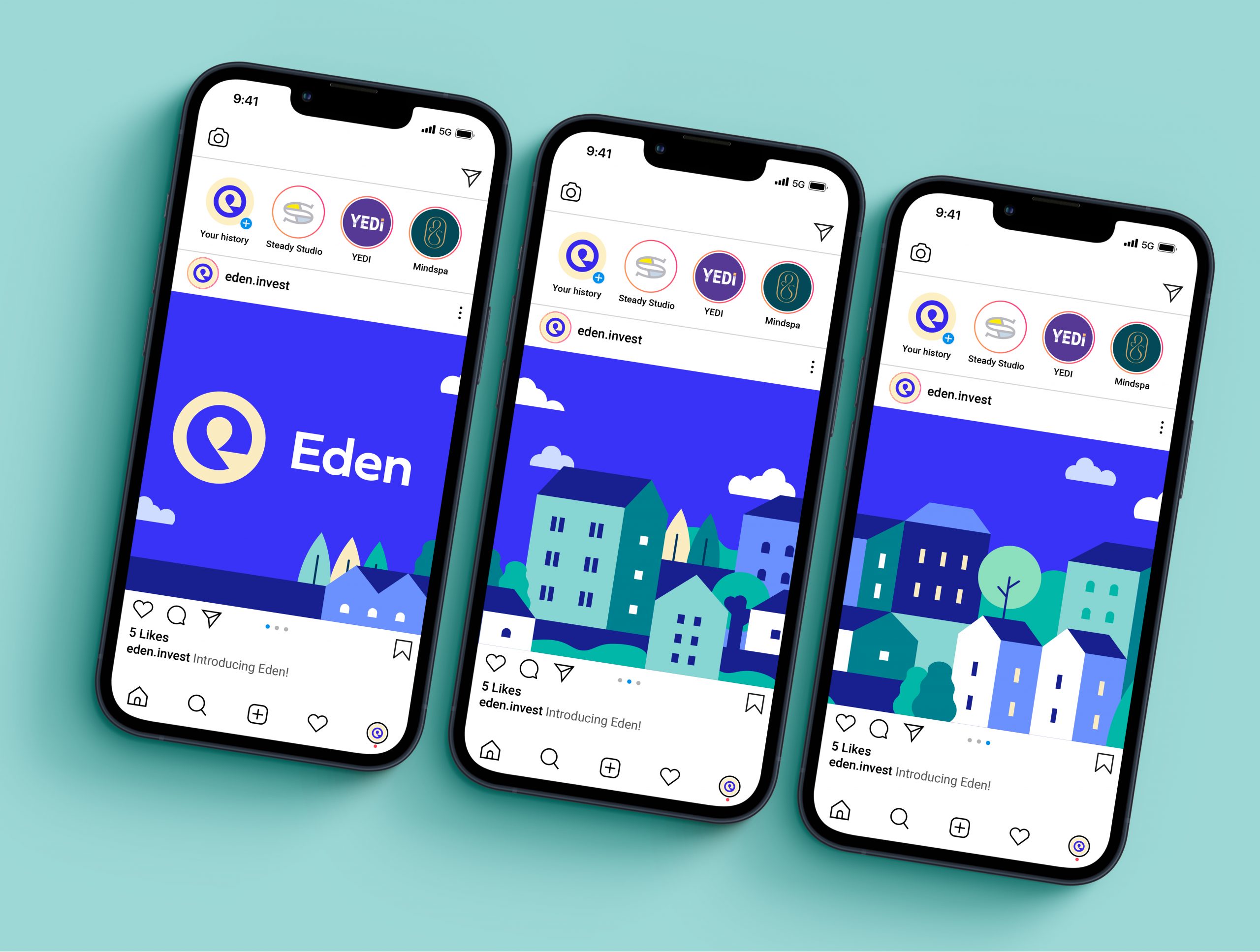
Cohesive and consistent brand colours help create recognition and familiarity, communicate personality and bring consistency to everything from your logo and website to packaging, signage, vehicle graphics, apparel and marketing materials.

Think about some of the brands you encounter every day. There’s a good chance you can picture their colours without seeing their logos. That’s the power of using colour consistently.

Your logo might be the most recognizable piece of your visual identity, but it doesn’t work alone. Over time, colour can become just as closely associated with your business.

And unlike your logo, colour can completely take over an environment. It can fill a website, cover a package, wrap a vehicle or turn an otherwise ordinary wall into something unmistakably yours.

That’s why we think about colour as part of a visual identity system. “Red is my favourite colour” is a perfectly good reason to buy a red Miata, but it’s not much of a brand strategy.

Your palette should be a considered choice based on your brand, your audience, your competition and how the identity needs to work in the real world.

What do different colours mean in branding?

Colours can carry familiar associations, but their meaning depends heavily on context and how they’re combined with other elements of a brand.

There are definitely some common associations:

Colour psychology chart

Research backs this up. A large systematic review found consistent associations between certain colours and emotions, but also found that those relationships vary across cultures and contexts.

But in our decades of experience, these associations are rarely one-to-one for any given brand. It’s way more complicated and interesting than that.

A deep forest green paired with cream and an elegant serif typeface can feel established, natural and sophisticated. Take the same green, pair it with a muted pink and chunky typography. The feeling shifts from established and sophisticated to bold and unapologetic.

Two designs side by side illustrating how colours can stay the same but feel different depending on context

So while a colour psychology chart can be thought-provoking, it’s not a paint-by-numbers guide to building a brand.

Should you choose colours based on colour psychology?

Colour psychology research suggests that colour can influence how people feel, think and behave, but also cautions against making overly broad assumptions about what individual colours will do.

Of course, that hasn’t stopped entire industries from gravitating toward the same colours. If every financial company chose blue because blue communicates trust, we’d end up with an awful lot of blue financial companies. Oh wait…

Familiar colour associations can be useful. Sometimes you want to communicate that you belong in a particular category. Other times, deliberately breaking with the conventions of your industry is exactly what will help you stand out.

Think less about what a colour is supposed to mean and more about the feeling it creates when you use it in a specific way.

Who is seeing it? What other colours surround it? Consider the typography, your competition and the personality you’re trying to create. Those answers are far more useful.

Unless you’re a bank. Then choose blue.

How do you choose the right colours for a brand?

The right brand colours should reflect your business’s personality, resonate with your audience, differentiate you from competitors and work across all the places your brand needs to appear.

When we’re developing a visual identity, we’re thinking about several things at once:

1. Your brand personality

Are you playful or serious? Bold or understated? Contemporary or traditional? Warm or clinical?
Colour is one of the tools we can use to communicate those qualities.

2. Your audience

Your personal favourite colour isn’t necessarily the best choice for your brand. It might make you feel the right way, but what matters more is how your clients and customers respond to it.
We’re designing for the people the brand needs to connect with, so understanding your audience matters.

3. Your competitive landscape

Looking at competitors isn’t about copying them. Quite the opposite.

If an entire industry looks the same, colour may be an opportunity to create some meaningful distance and contrast.

4. How the colours work together

A brand rarely has just one colour. And when it does, embracing that limitation should be an intentional choice.

Take our client Chef Mark’s Crisp Cuisine, where we essentially took brand colour off the table. The identity is almost entirely black and white, clearing the way for colourful photography and video of Mark’s food to pop off the screen.

Primary colours, secondary colours, neutrals and accent colours all need to work together. A great palette gives designers enough flexibility to create variety while making everything feel unmistakably part of the same brand.

5. Where the brand will actually live

A palette might look beautiful on a designer’s screen, but what happens when it’s printed? Embroidered on a shirt? Applied to a vehicle? Shrunk down to a tiny jpeg for a website? Printed on uncoated cardboard? Practical considerations like this are an underrated aspect of superior brand design.

Accessibility matters too. On websites and other digital applications, brand colours need enough contrast to keep text and important interface elements readable.

Does your logo need to work without colour?

Yes. A hundred times yes. A good logo should be recognizable and functional even when colour isn’t an option. Colour can make a logo more distinctive, but it shouldn’t be doing all the heavy lifting.

There will inevitably come a time when your logo needs to appear in black, white or a single colour. That’s why we develop identity systems that can adapt to different applications rather than relying on one magical full-colour version that somehow works everywhere.

Your visual identity becomes stronger when its individual pieces can stand on their own.

Can colour make a brand more recognizable?

Absolutely, particularly when a distinctive palette is used consistently over time. The key word being consistently.

Of course, material limitations mean an absolute and perfect colour match across every application is unrealistic and impractical. But making a habit of “close enough” weakens the system. So does introducing new colours every time a design feels like it might be “missing something.”

Brand guidelines help prevent the natural entropy that comes with managing a brand by defining exact colours and how they should be used across print and digital applications.

Over time, repetition builds familiarity. Familiarity builds recognition. Eventually, people don’t always need to see your logo to have a pretty good idea whose brand they’re looking at.

Your brand is more than a hex code.

Choosing brand colours is part psychology, part strategy, part design and, yes, part instinct.

There isn’t some closely guarded secret formula that determines your accounting firm must be blue or your organic granola company must be green.

Sometimes doing exactly what people expect is the least interesting choice you can make. Other times, meeting those expectations is exactly what a brand needs.

The goal is to create a palette that feels appropriate for your business, distinctive within your market and flexible enough to grow with your brand. That means understanding your business, audience and goals before you can choose brand colours with confidence.

And when the right colours come together with the right typography, imagery, messaging and logo?

Now you’re going Steady.

Ready to go Steady?

If you’re starting something new, refreshing an existing brand or just aren’t sure whether your current identity is doing its job, let’s talk. We’ll help you build a visual identity where every colour has a reason for being there and everything works together to feel unmistakably yours.